
CRM reporting starts working when a business can clearly answer simple questions: What’s happening with sales? Where are leads being lost? How is the team performing? And what truly impacts profit? To make these answers understandable and quickly digestible, the data needs not only to be collected but also visualized — charts, tables, and KPIs make the information more tangible and help managers make decisions without unnecessary interpretation.
Calls, meetings, emails, deals, or service requests alone don’t solve anything — value appears when this data is recorded consistently and transformed into clear visual reports and KPIs within the CRM. Today, this is not a matter of convenience, but of business scalability. As the customer base grows, team workloads increase, and the number of touchpoints with each client rises.
We covered in a separate article how a CRM reporting system is built, which KPIs genuinely influence management, and how to structure analytics correctly. In this article, we focus on the practical side — how dashboards help turn these metrics into a tool for daily management.
Charts and tables on dashboards are built around specific metrics: conversion rates, average check size, manager activities, or response times. This allows managers to immediately see metric trends and deviations from the plan, while the team understands which processes require focus. In this format, KPIs become a guide for daily work and systematic performance monitoring.
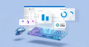
The SMART CRM platform by SMART business offers ready-made analytical tools for data-driven sales and service management. Built-in dashboards and Power BI integration allow managers, team leads, and operators to see the status of deals, inquiries, and SLA compliance in real time.
Example of a sales analytics dashboard in SMART Sales solution
The Power BI analytics panel integrated into SMART Sales displays key sales metrics without the need to manually gather data or consolidate reports in spreadsheets.
Managers or team leads can immediately see such key metrics as:
Filters allow instant adjustments to the data view:
Visualizations complement the picture:
The essence of this dashboard is to give managers and teams a clear understanding of sales performance, enabling:
Example of an operator dashboard in SMART Customer Care solution
The operator dashboard in SMART Customer Care combines analytics and the daily work plan in a single window, transparently showing:
Separate activity blocks show:
The value of this dashboard is that the company does not operate “blindly.” It can quickly assess the situation, set priorities correctly, and maintain consistent quality in customer interactions even with a high volume of inquiries.
Example of a service manager dashboard in SMART Customer Care solution
The service manager’s workspace in SMART Customer Care focuses on monitoring SLA compliance and the quality of team performance.
The dashboard displays:
Detailed tables allow managers to quickly move from high-level analytics to specific cases and understand the root cause of an issue rather than simply recording the fact of a violation.
The essence of this dashboard is to transform SLA monitoring from a formal check into a live service management tool: identifying systemic failures, adjusting processes, and improving customer satisfaction based on data.
Example of Binotel Manager Dashboard in SMART Connectors solution
The Binotel Manager Dashboard is part of the SMART Connectors analytics, which integrates telephony directly with the CRM. In essence, it is a single workspace for analyzing calls and the quality of how they are handled by the team.
The dashboard consolidates all key data related to phone interactions with customers. The manager sees a list of calls with details: when the contact took place, whether it was successful or canceled, and which team member was responsible for handling it. This eliminates the typical question, “Who called the client, and what happened next?” A separate chart shows the number of calls by day, allowing managers to quickly assess team workload, identify peak days, and correlate them with sales or service results.
An important management block covers missed calls and related activities. The dashboard immediately highlights unprocessed calls, open tasks, scheduled contacts, or drafted but unsent messages. This helps prevent customer loss due to minor lapses in discipline.
For managers, call analytics by employee is particularly valuable. It shows who is actively working with customers and where workload distribution may be uneven. Additionally, the dashboard displays call priority levels, helping the team focus on the most critical or valuable contacts.
Overall, SMART Connectors transform raw telecom system data into clear CRM analytics, enabling managers and sales or service teams to:
Example of a marketing activity dashboard in SMART Marketing solution
This dashboard within SMART Marketing provides a comprehensive view of marketing activity in Power Apps — from campaign statuses to channels, sources, and communication quality.
What it shows:
Thus, the SMART Marketing dashboard transforms fragmented campaign data into clear analytics that helps the marketing team work in a more predictable, structured, and results-oriented way.
When all sales, service, marketing, and communication metrics are consolidated within a single CRM system, managers no longer rely on subjective reports or fragmented information from teams. Instead, they see a complete picture of processes in real time.
CRM analytics in SMART CRM enables companies to:
Thus, analytical dashboards become the foundation of daily management: they help plan, forecast, and timely adjust business processes.
SMART CRM helps transform sales, service, and marketing data into clear management analytics. If you want to see the real picture of your business rather than manually compiling reports, start by reviewing your own processes.
Request a consultation of SMART business experts to transform your operations into measurable metrics and improve your team’s performance.